

Eunjoo Hong
delikit@gmail.com
@repetitivelyrepeat
Hyungjae Kim
personak@gmail.com
@hk_of_ehhk
#303, 101–27, Euljiro 2-ga, Jung-gu, Seoul, 04542
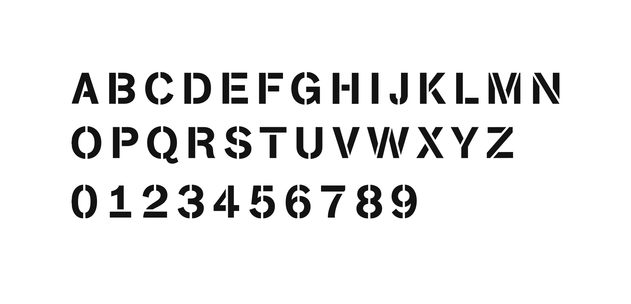
Stencils are often used in shipping cartons, packing containers, and signs as a technique to quickly and easily mark the surroundings.
Imagine the actual use of this stencil technique:
a panel containing the opinions of a small number of hand-made people; the walls of the back alleys of the big city; the box surface of logistics; the Tlatelolco protests; the port and the warehouse, etc.
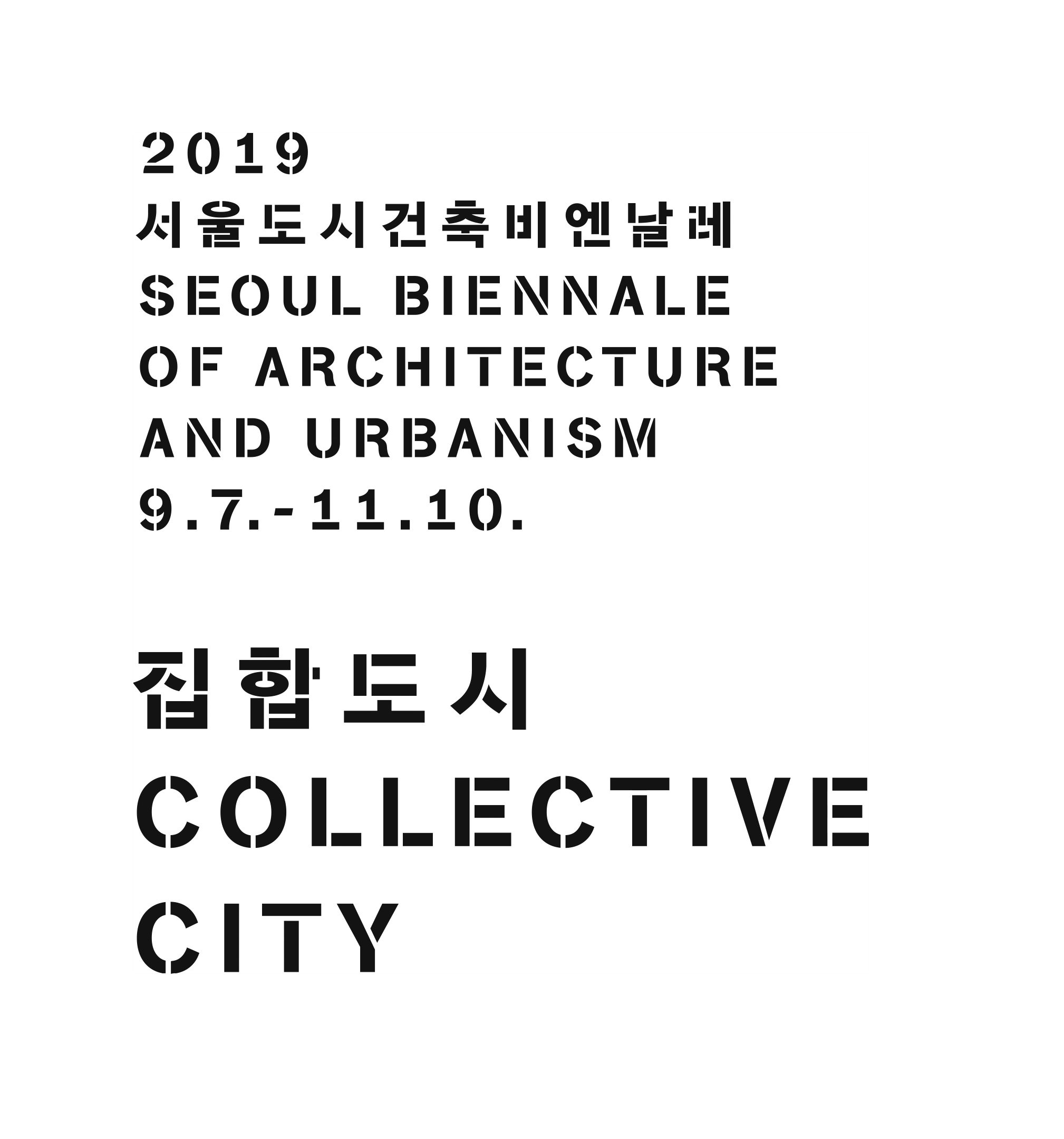
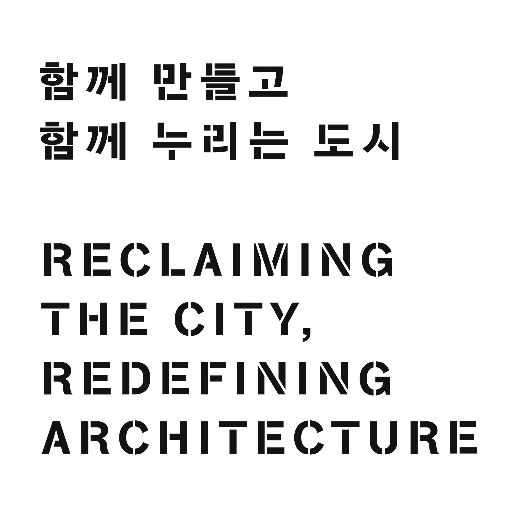
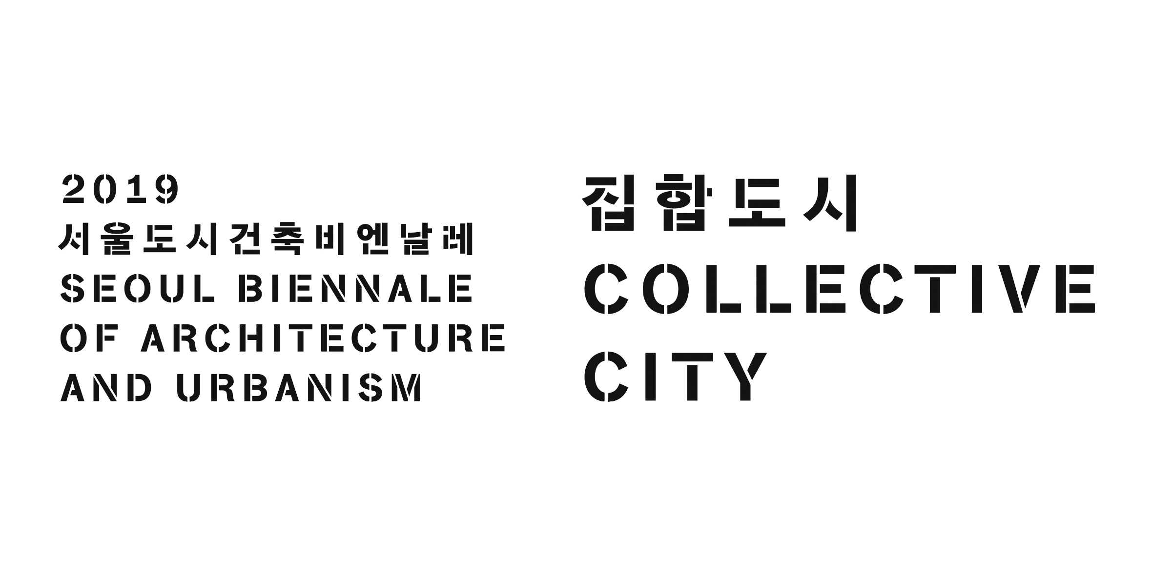
In other words, we thought that the rigid, simple form of the stencil typeface and this typeface are actually part of urban mobility, such as logistics, industry, and distribution, while at the same time being a visual tool that people use in a non-standard manner, such as temporality, stigma, protest, and resistance.
The stencil typeface was placed at leisurely intervals to dilute the firmness given by bold Sans serif characters while expressing the fluidity and structure revealed in the subject through the junction line’s shape. In other words, the scene of a cross between definitive clarity and temporary labeling is the point we aimed at in designing this identity.
